The Psychology Behind Colour in Branding 🧑🎨🌈
The Psychology Behind Colour in Branding 🧑🎨🌈
A newsletter about design and creativity, and how they contribute to a better world.
Welcome to Edition #35 of HUMAN. Small update from us, for the month of March, we’ll be trialling HUMAN as a weekly newsletter (rather than bi-weekly) so we can share even more thoughts and industry news with you. We've also shifted the purpose of our humble opinion section, making it a place where each week different members of our team will answer and explore questions we get asked by our community every day.
In summary of today:
Highlighting our latest article of Look it Up! where we have an interview on creative coding with Alexia Mathieu, written by Ruth Walsh.
How colour can impact a brand’s perception? We discuss how we approach the psychology of colour choices in branding.
This week’s interesting design and creativity finds from around the internet.
The great architectural works of David Chipperfield.

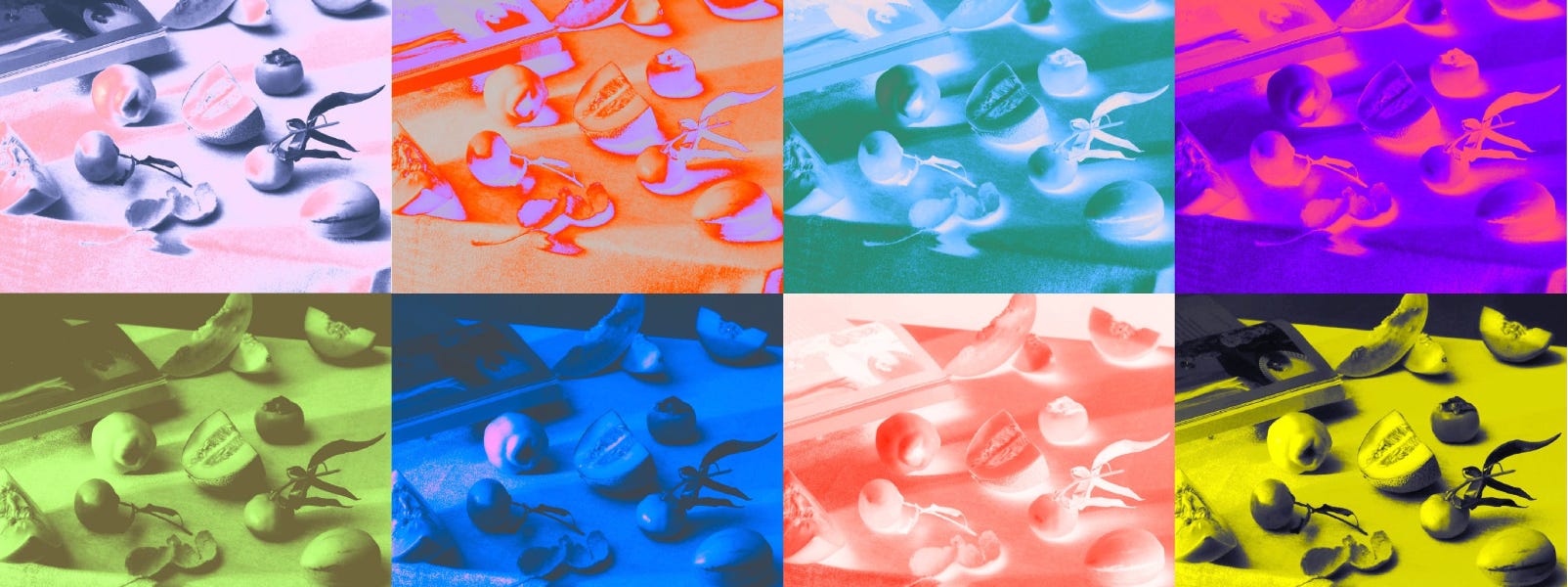
“In our humble opinion” we try to answer any questions you may have regarding design, creativity, branding, and digital experiences. This time we’ll answer how psychology affects colours in branding.
The Psychology Behind Colour in Branding
It has long been thought that colour can elicit a wide range of emotional, behavioural, and even physical responses. For instance, red is commonly dubbed as stimulating and exciting, while blue is calming and wise — something most of us have heard or even felt before.
But when we dug into this further, the real evidence of colour-emotion associations is mixed and the claims that we found online are usually unaccompanied by any kind of evidence or reference to why or how that association may occur. Both aspects are essential to consider when attempting to appeal to a certain audience or have your brand perceived in a certain way.
Further, the types of associations between colours and emotions differ widely across cultures, rendering the initial intentions behind a colour choice useless depending on your market. Here, we take a quick dive into the evidence and discuss how we tackle our colour choices at Wonderland.
Can your colour choices affect how consumers perceive your brand?
Yes, a brand's colour will probably affect consumer perceptions of your product, but this is going to vary dramatically based on your target audience. Even though this article is nearly 20 years old at this point (written in 2005!) researchers at the University of Wollongong in Australia wrote a comprehensive review of the colour literature up until that point. They illuminated the wide range of colour associations across cultures. For instance, it’s common in the Netherlands to associate the colour yellow with warmth and happiness, and if we were to Google for emotional associations with yellow in England, we would probably be fed more of the same information, therefore reconfirming the perception across two nations.
However, if we start to research further afield, researchers found that yellow was associated with happiness in South Korea and Japan, but with envy and jealousy in Germany and Russia. Even more diverse in its perception, purple was found to be associated with envy in Mexico and Poland, fear in Japan, and love in China and South Korea. The researchers at the University of Wollongong found that cultural associations with colour are diverse and varied, highlighting the importance of understanding one's target audience when considering the impact of colour on consumer perceptions.
How do you approach colour choices at WONDERLAND?
So, with the exact perception of colour being difficult to pin down, how exactly do we go about choosing a colour pallet for a brand or a website? When it comes to the cultural context, the best thing to do is to test your designs on different audiences to whom you might be trying to appeal - just to be sure you aren't missing anything.
In our branding process, after our strategy team has identified a target audience for a particular brand or product, we test different design routes and assets using surveys. We prefer using Pollfish since it allows us to hyper-focus on the target audience, specifying certain age groups in specific countries, speaking specific languages, and/or having specific jobs. This enables us to check how colours and other brand assets are perceived and the emotional associations or contexts that the target audience has with our colours.
Further, open-ended questions allow us to dig further into the cause of these feelings and associations. While generic differences or colour associations might apply in some cases, it's always best to double-check with your audience.
Written by Martijn van der Does and Molly Rooyakkers
Do you have a design-related question that you would like to have answered? Mail them to us at hello@wonderlandams.com and we’ll take it from there.


This week on the blog, we have the latest edition of Look it Up! our monthly interview series that deep-dives into the niche and the cutting edge of design and technology - answering all the questions you never dared to ask your designer friends.
In this edition, Alexia Mathieu, Head of the Master Media program at the University of Art and Design in Geneva, discusses the need for diversity and inclusivity in the machine learning and AI. She addresses the problematic use of AI in today's world and highlights her goals centred around clean data sets, exploring machine learning with a more inclusive and collaborative approach, and improving our interaction with AI.
Look it up! is spearheaded by Ruth Walsh. She is on the Creative Account Management Team but also blogs on the side. In this short and sweet series, there will be eight editions, all tackling the questions you never dared to ask your designer friends. Hot topics like AI will be covered alongside more dormant subject matters that people might not be so aware of. The idea is to share knowledge and highlight the niche and cutting edge of this digital world we live in.

For International Women’s Day, TEDxAmsterdam Women and ACE initiative created MissJourney.ai — an AI alternative that exclusively creates artwork featuring women. The aim of this project is to actively promote inclusive digital realities and challenge societal norms that have contributed to gender bias.
New York Mag features Linguist Emily M. Bender, a linguist who discusses the limitations and probable repercussions of large language models like Chat-GPT and Galactica, which lack access to real-world referents and are built on statistics, making them great at mimicry but bad at facts.
All you need is creativity: It’s Nice That asked creatives to imagine love letters for their practice, and the results may be just what you need to reinvigorate your love for your creative process.
Pinterest uses its own search data to make trend predictions for 2023, with everything from rainscapes to romcom core expected to surge this year.
Why are people mad about the new Nokia logo— and is it warranted?
Curious how AI will influence front-end development? Have a read here.
How to generate design systems using deep learning.
How to Avoid Collaboration Fatigue in your design teams.
How designers and developers can pair together to create better products. Cross-functional collaboration, for empathy and results.

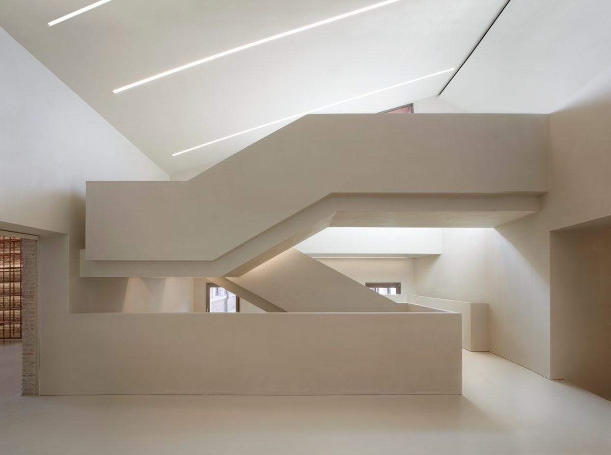
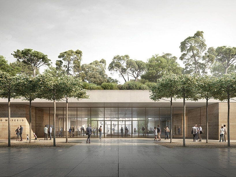
David Chipperfield, a British architect known for his subdued and contextual buildings, has been named the latest laureate of the Pritzker Architecture Prize, the highest honour in architecture.