🧚🏼 Designing for accessibility
🧚🏼 Designing for accessibility
A newsletter about design and creativity, and how they contribute to a better world.
Welcome to Edition #40 of the WONDERLAND newsletter, now called Creative Currents.
We recently made the decision to change the title of our newsletter from HUMAN to CREATIVE CURRENTS. This change was motivated by a desire to better reflect the focus and goals of this newsletter: providing our readers with the latest trends and movements in the world of design and creativity.
While HUMAN was a meaningful and evocative title for us at the time of this newsletter’s inception, we felt that it did not fully capture the dynamic, forward-looking nature of our content.
CREATIVE CURRENTS on the other hand, conveys a sense of movement and energy, suggesting that our newsletter captures the flow of the ever-changing landscape of creativity and better aligns with our mission to provide insightful and engaging content to our readers.
In summary of today:
Our take on designing for accessibility.
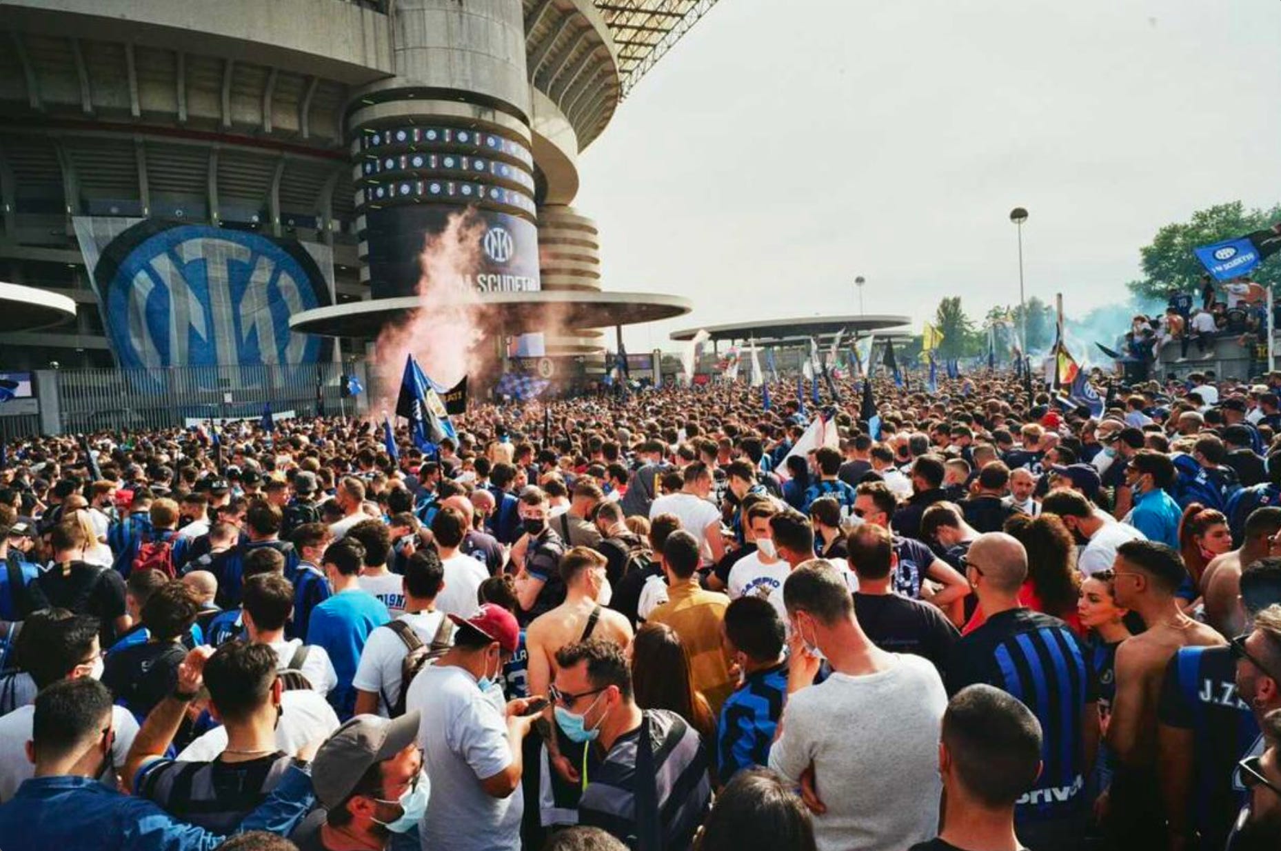
For World Press Freedom Day, we have launched #Erased together with Free Press Unlimited and 180 Global.
Our current creativity and design finds from around the internet this week.
An introduction to the cozy web and its implications for brand strategy.
Highlighting the rebranding of Inter Milan FC.
Designing for accessibility
Consumers are interacting digitally with twice as many industries as before the COVID-19 pandemic, according to the Global Digital Sentiment Survey. And there is also an interesting angle from a business perspective; companies can build loyal, valuable relationships with these consumers.
It’s estimated that consumer companies with inaccessible websites and digital strategies lose $6.9 billion annually as frustrated consumers take their business elsewhere. So what is digital accessibility? For us, it’s freedom in every aspect of someone’s “digital” experience. Simply put; it is to provide a seamless experience when someone is interacting with any online content using whatever screen reading technology or device they prefer.
A few tips to ensure you’re delivering a cohesive “accessible” digital experience:
Follow best practices on design as established by the W3C Web Accessibility Initiative.
Embracing co-design and collaboration with your developers when creating your design. Point your developer to these tips.
Write accessible web copy. Here’s a great post that dives into this topic more.
Be considerate when including animations in your project, this link explains, here. This link covers a lot of these aspects.
Prioritising digital accessibility is not just the right thing to do, but it can also deliver significant business benefits by deepening customer trust and broadening your customer base. It's clear that the fundamentals of good design - collaborative design and continuous improvement of your digital experience - are essential to creating a deeper relationship with your customer.
Do you have a design or creativity-related question that you would like to have answered? Mail them to us at hello@wonderlandams.com and we’ll take it from there.
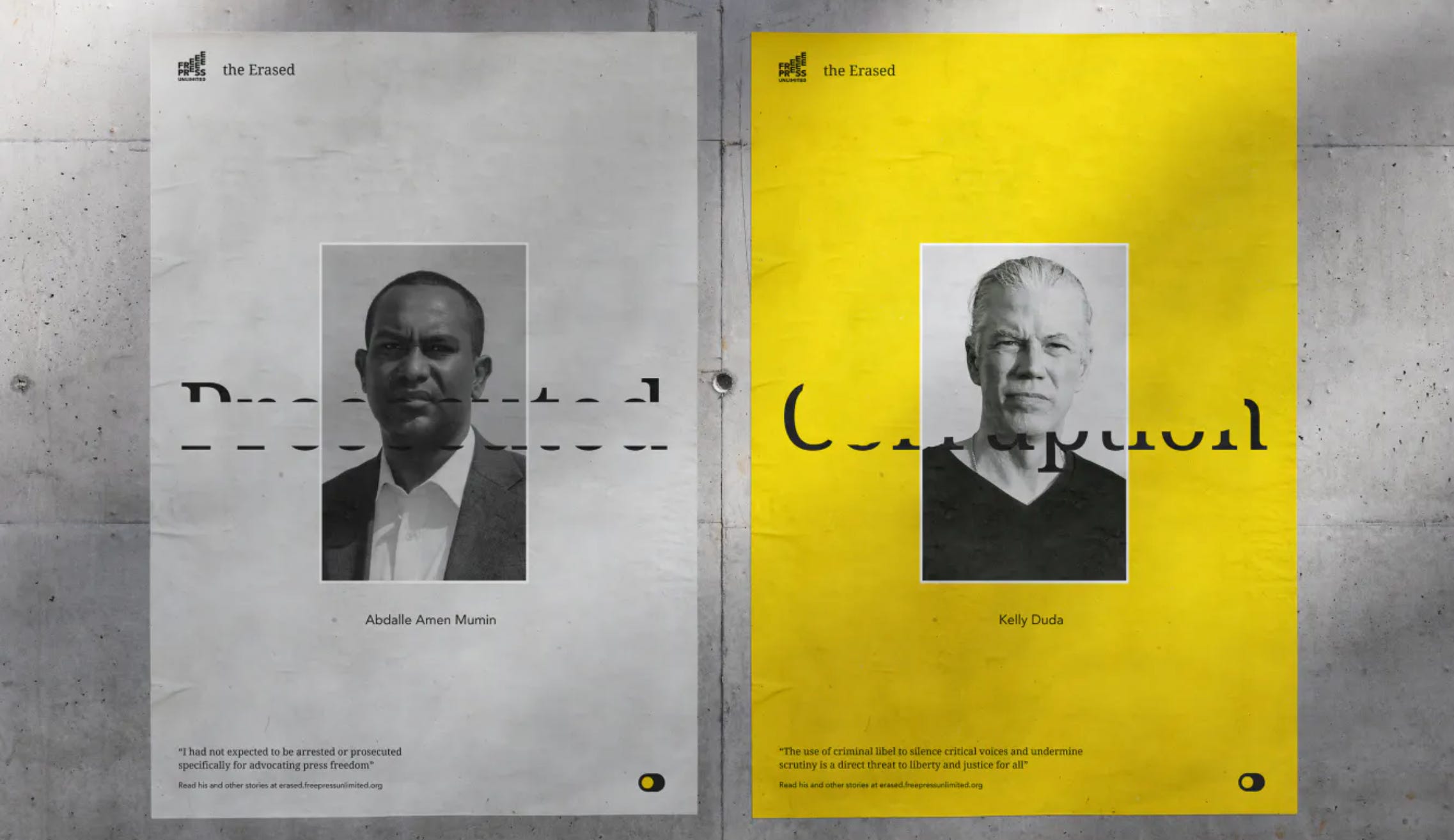
For World Press Freedom Day, we have launched Erased together with Free Press Unlimited and 180 Global.
There have never been more journalists imprisoned than today. Last year alone, there was a 20% increase. A characteristic of the problem of censorship is that it’s invisible to the public because we can’t read what isn’t published.
For this project, Wonderland created a digital experience that highlights the Erased font, which removes one letter from the font for every journalist who is imprisoned. The team at Wonderland is incredibly proud to be part of this journey as the digital creative partner, and give a massive thanks for the great collaboration with Free Press Unlimited and 180 Global.
This week’s interesting design, creativity, and green initiatives finds from the web.
Musicians will own the next-generation of creative agencies.
Which areas of design need investment to reach 2030 sustainability goals?
For the people in Amsterdam, find bars / restaurants with the most sun
Have you heard about the ‘Cozy Web’? Let us take you through a rapid onboarding of the latest and greatest place to spend your time on the Internet.
Venkatesh Rao coined the phrase "cozy web" to describe the internet's secluded enclaves, which are gate-kept (you need to be geeky enough to find these communities, be invited, or apply) and to which we have all withdrawn in recent years for comfort and privacy. It’s the place we have discovered and are now deciding to connect with communities gathering around niche interests and to escape the invasive and noisy clammer on Web 2 and open platforms.
So, why is this trend occuring?
With more and more people moving away from open platforms and deleting apps due to spending way too much time on them or being overstimulated by the onslaught of irrelevant content, there is a growing appetite for people to feel like they are part of a community and where they can actively co-create and feel seen. Take Gucci’s Vault for example, the luxury fashion brand has launched a new online store that is the epitome of the cozy web. See what by Laurent Francois learnt when he went on Gucci Vault’s Discord server.
The takeaway?
Brands should implement their own cozy web by focusing on building their community facilitating two-way communication online, and creating a space for their community to both engage with your brand and with each other.
Want to learn more about the cozy web, creating an online community, and the implications of this trend? Check out the links below:
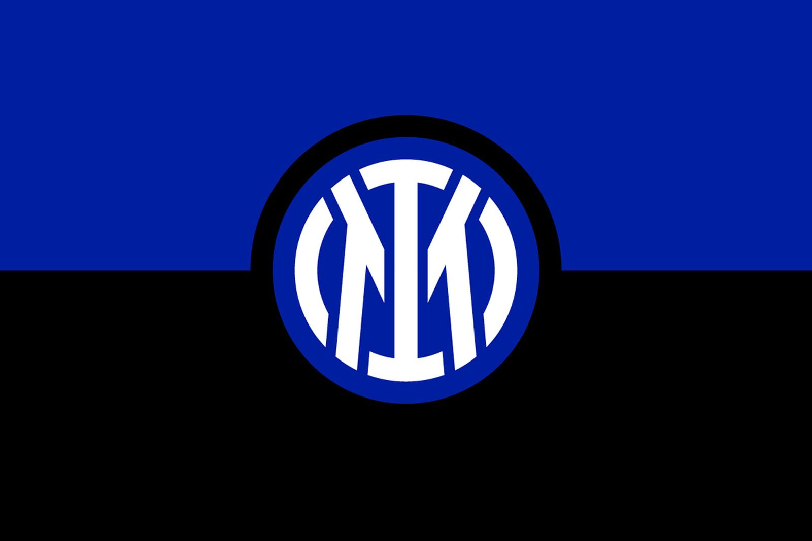
"The colors remain those chosen on the 9 March 1908 - night of the club's founding - made more vibrant and vivid."
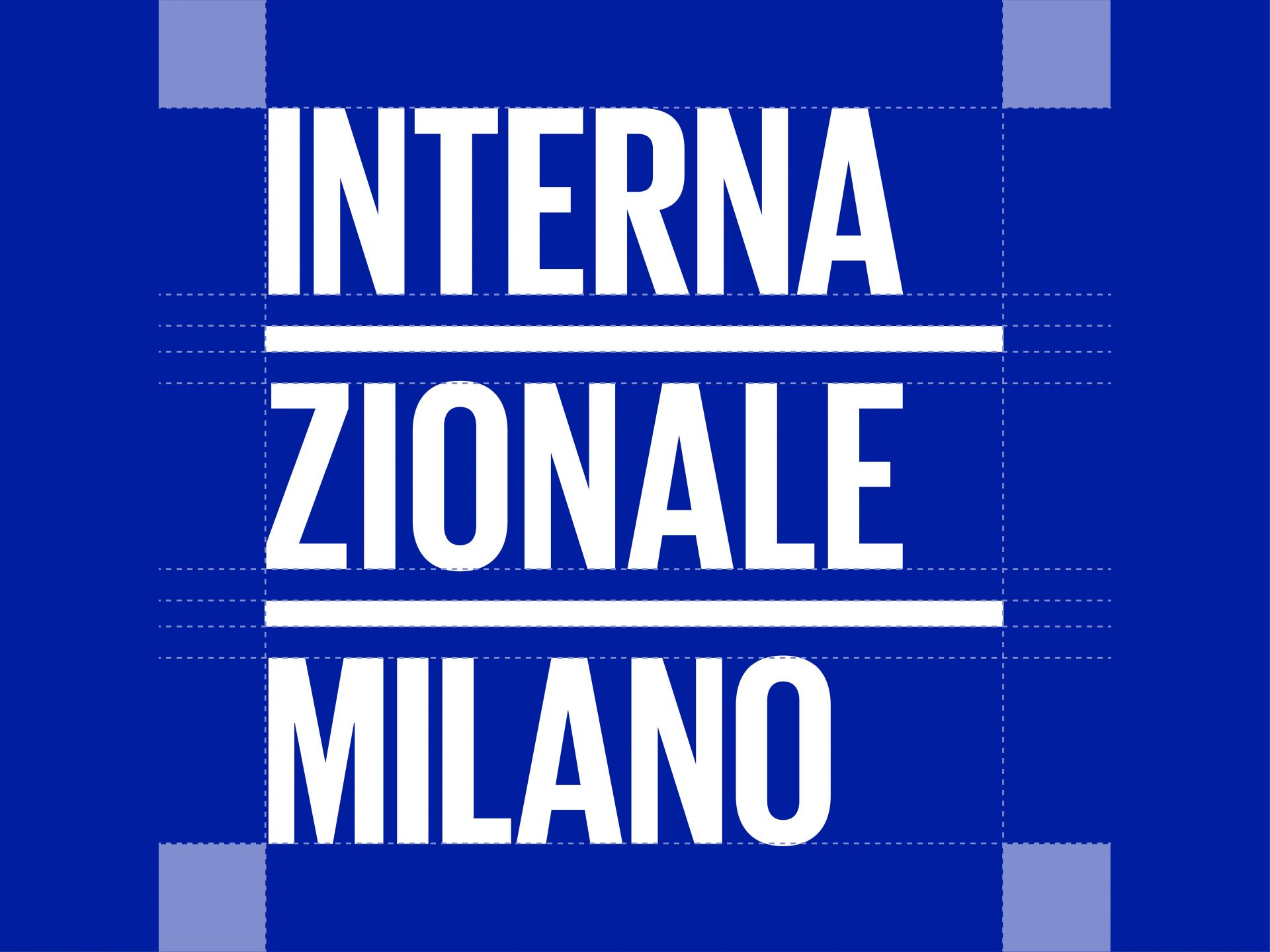
Touching the untouchable. How to think and design a new identity for Inter Milan FC, a city, a nation, while respecting the history, values and tradition of the 113-year-old football club. How to make that new identity accepted by the client when the client is a passionate city of 1 million supporters.
Innovative, minimalist, elegant and oriented towards new generations. The new visual identity extols the club's founding values and renews its bond with the city of Milan.
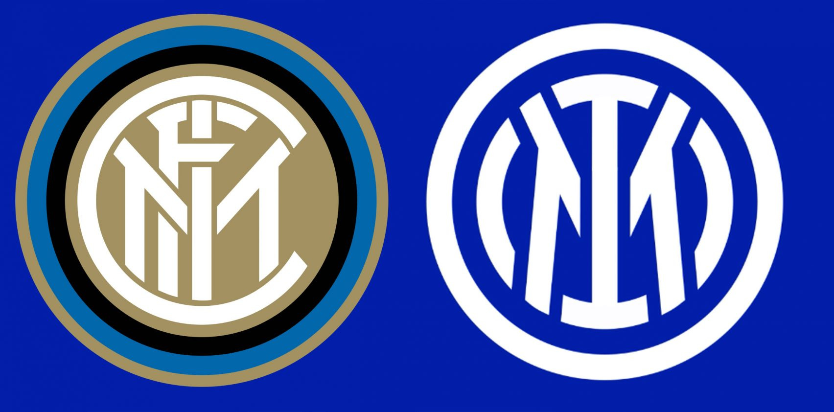
The revamped badge removes the letters FC, which stand for football club, from the logo. "Inter has moved to revamp its visual identity to open up to an audience that is increasingly digital and sensitive to aesthetics, to reach global targets and different age groups, and establish itself as an icon of culture as well as sport," said the club.
The crest update was handled by graphic design legend Mirko Borsche of Munich-based design house Bureau Borsche, whose projects in recent years include several notable rebrands.
In its 113-year history, Inter's logo has undergone various manifestations, with the biggest change last coming in 2014. The focus is on the letters I and M, which have been preserved from Giorgio Muggiani’s original design and are framed by the classic concentric circles. Letters F and C, meanwhile, remain in the name and identity of the club: FC Internazionale Milano. The colors remain those chosen on the night of 9 March 1908 - night of the club's founding - made more vibrant and vivid."